Chelsea’s third kit for the 2020/21 season has officially been released and the design looks oddly similar to another Premier League club’s jersey – Crystal Palace.
Meet a new legacy. The 20/21 @nikefootball third kit is here! 🔥
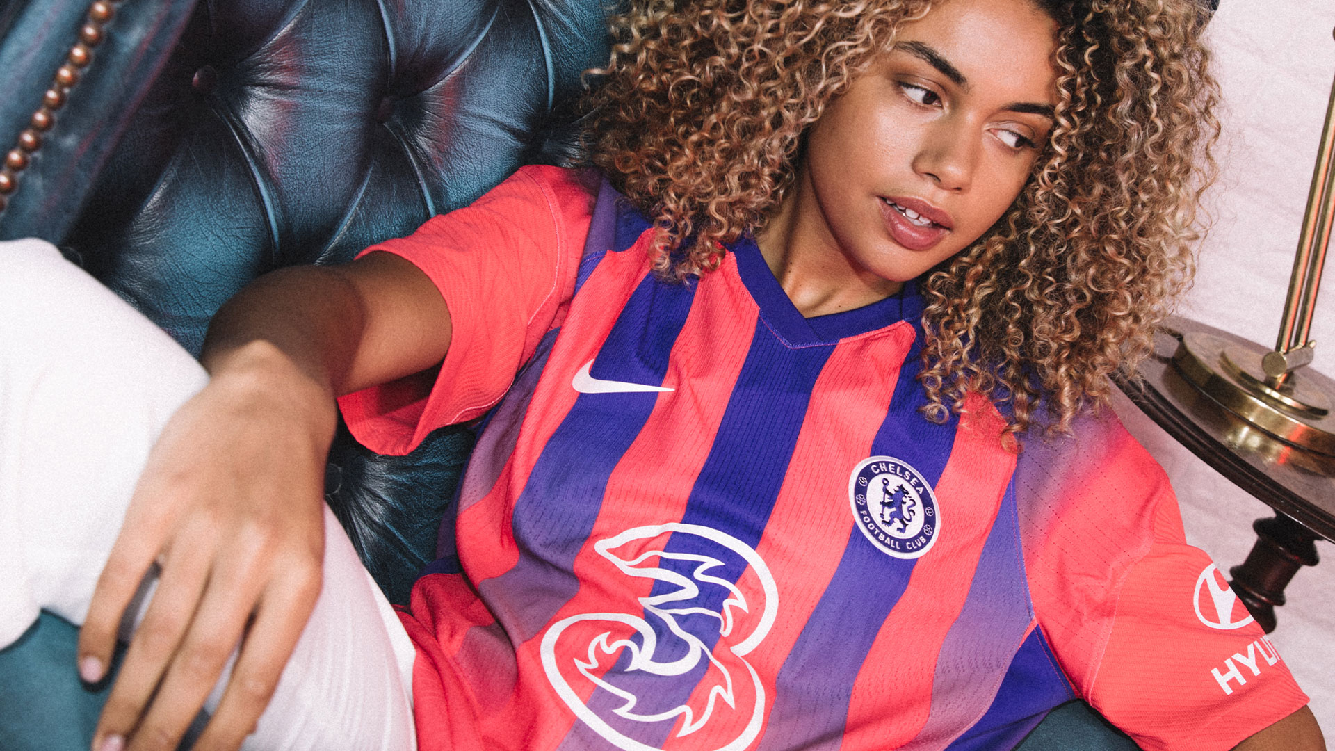
One for the sneakerheads 👟, inspired by the 1990s Ultramarine Air Max 180 and classic shirts of the past!
Available 10.09.20. #ItsAChelseaThing pic.twitter.com/mWRnkhCMWh
— Chelsea FC (@ChelseaFC) September 7, 2020
The kit, which Chelsea will wear for their European campaign, is part of a wider Nike collection that celebrates jersey culture and the iconic Air Max archives.
The Blues’ new design is influenced by the original Air Max 180, a shoe first released in 1991.
The primary colour of the kit is ember glow, with ultramarine blue running through it as thick stripes. The blue appears on the jersey’s V-neck collar, shoulders, and on vertical stripes which gradually fades away down the front of the shirt.
After the kit was released, fellow Premier League side, Crystal Palace, who somewhat bear the same colours of the kit hilariously replied Chelsea’s tweet with the post “#ItsNotThoughIsIt”.
#ItsNotThoughIsIt https://t.co/Jjh7eLot04
— Crystal Palace F.C. (@CPFC) September 7, 2020
Other social media users have gone ahead to make fun of Chelsea’s new third kit and linking it to Crystal Palace.
This is not a Chelsea thing…it’s a disgraceful thing🙆🙆why….why?
— Ruth Chelsea 💙🇿🇲🇿🇲 (@ChibekaRuth) September 7, 2020
Crystal palace shaking
— J.M (@JordanMMcl) September 7, 2020
— Stade Malherbe Caen (@SMCaen) September 7, 2020
Fire whoever designed this. Worst kit in the history of chelsea football club 🤮🤮🤮
— JoshCFC (@GermanWonders) September 7, 2020
oh no it’s official 😭 pic.twitter.com/6f1Zits37r
— Alia (アリア) (@AliaBatrisyiaa) September 7, 2020
Sick kit pic.twitter.com/tUAEOUsdgU
— Kova boss level💙 (@chriskenyonblue) September 7, 2020


